


Client: Finnish Energy (Energiateollisuus ry)
Implementation period: 2024
Why was the work done?
Finnish Energy had previously developed new graphic elements alongside a website update, but the overall visual identity and its applications were not aligned with these changes.
Kaskas helped Finnish Energy unify its visual identity. The goal was to present Finnish Energy as clearly renewed, yet still easily recognizable. The entire visual package also needed to be clearly documented in a single, cohesive format.
What did we do?
Together with Finnish Energy, Kaskas identified the key challenges in the visual identity through a visual workshop and by engaging the entire staff via a survey. We helped unify the visual system, improve accessibility, and ensure consistency across materials. The result was a coherent and practical visual identity manual.
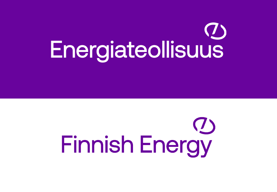
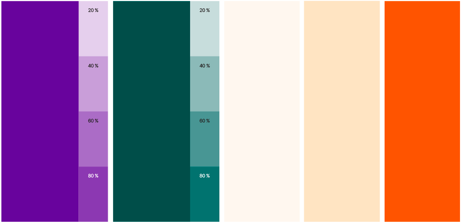 In a joint visual identity workshop, we analyzed the significance of colors for Finnish Energy’s brand. Purple was seen as one of the most distinctive features, but its shade was adjusted to better suit the present day. The role of orange, on the other hand, was reduced.
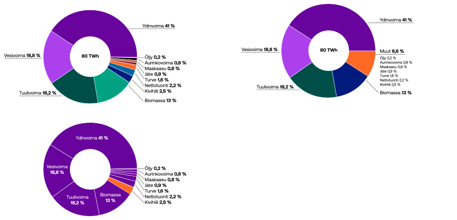

How did we do?
“Working with Kaskas was incredibly smooth and rewarding. Their experts quickly understood our needs and goals. The new visual identity that resulted from the project reflects Finnish Energy’s values and objectives exceptionally well.”
Client testimonial
We involved Finnish Energy throughout the identity development process, and the result was a modern and accessible visual identity that the entire organization is excited about.
Finnish Energy (ET) represents companies that produce, acquire, transmit, and sell electricity, gas, district heating, and district cooling, as well as provide related services.
Contact us
Need help with designing your organization’s visual identity or other visual communication efforts? Read more about our visual communication services and don’t hesitate to contact us!